1.12 Lazzaro Soardi's Mixed Messages
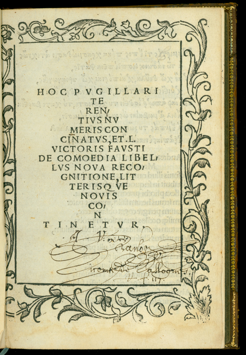
Benedetto Ricardini explicitly cited the Bembinus in a 1505 Giunta edition, reprinted in 1511 by Lazzaro Soardi, who had been the innovator in providing illustrated Terences to the Italian market. (57) Soardi, like the Giunta, presented the Ricardini text in octavo. We might have treated this edition under the rubric of octavo formats, but Soardi's quirky typography and formatting were less influential than the contemporary Aldines, and the real significance of this edition lies in its use of the critical text as a marketing tool. Soardi surrounded his octavo (and in other cases, 12mo) pages with prettifying floral borders. He employed a fussy italic of his own design for the text and filled out the spaces at the end of short poetic lines with curlicues. Any space left at the end of a volume he filled up with jocose addresses to the reader, and he often provided front matter in the same vein.
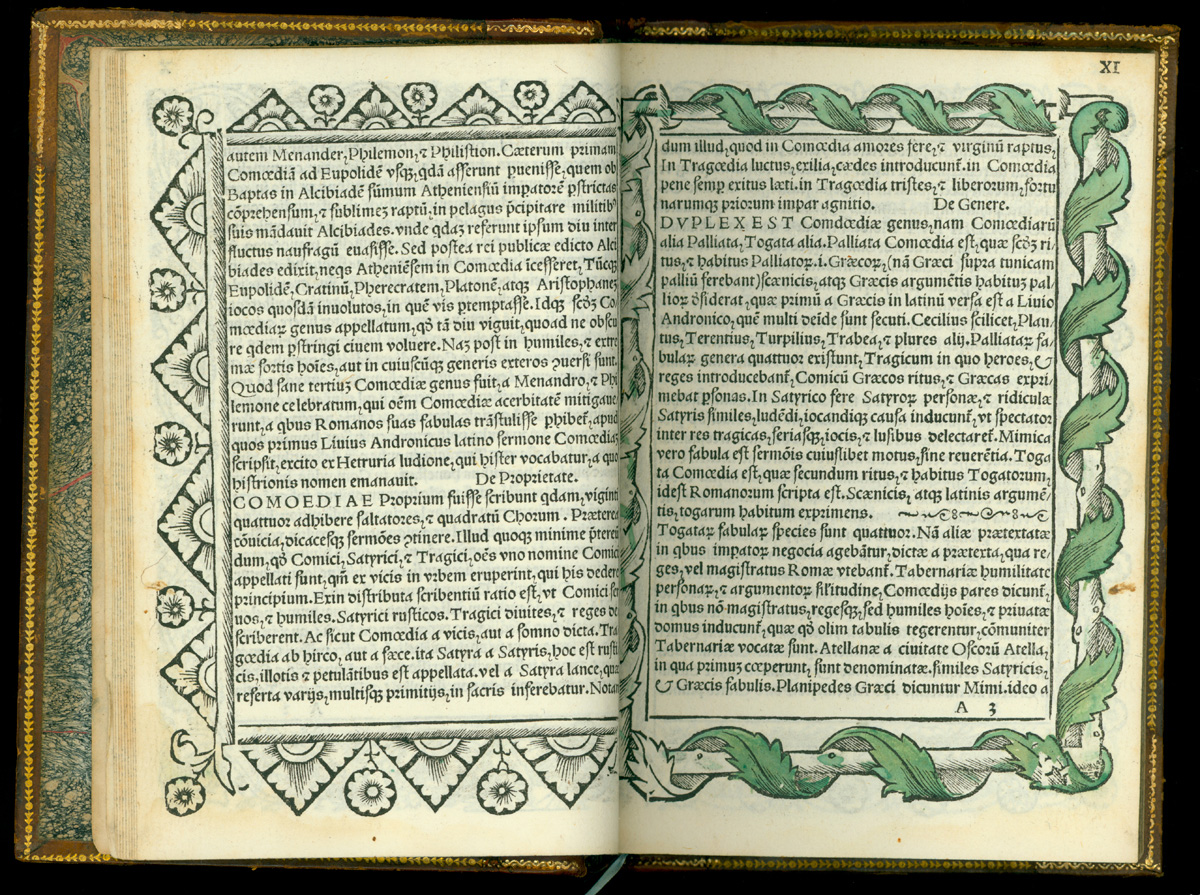
Soardi's 1511 Terence is crowded and busy in the extreme. To the modern eye this odd design might seem to undermine the textual claims of its serious humanist editors. It is hard to say, however, that early sixteenth century readers would have judged it in the same way. Since Soardi was producing fully illustrated and annotated folio Terences for teachers throughout this same period, it seems likely that he saw these little octavos as strictly student copies. In their pretend-naïve ornamentat
[caption id="attachment_797" align="aligncenter" width="288" caption="Title page text (click to enlarge - 458 KB jpeg file)"]<img class="size-full wp-image-797" title="wing-zp-535s-6755-hvc-pugillari-title-page-detail-thumb" src="http://www.humanismforsale.org/t
Soardi's advertising prose was similarly in-between, alternately pretentiously scholarly and deliberately childish. Despite its floral border the title page is highly typographic. Arranged in a lozenge shape is an all-caps inscription that reads, "In this portable [book] are contained Terence
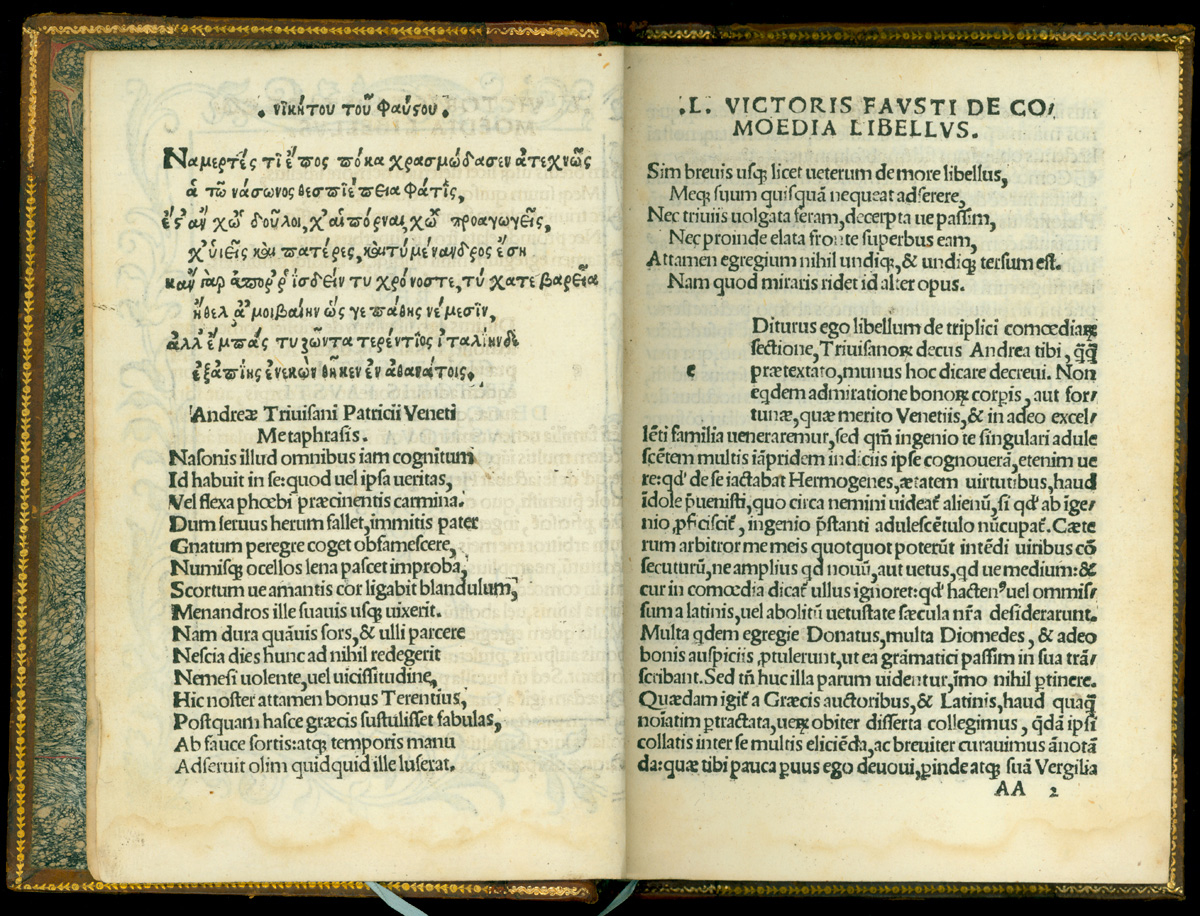
Significantly, when it came time to introduce his humanist editors and their work, the design changed, for on the very next page, the verso of the title, Soardi launched into old-fashio
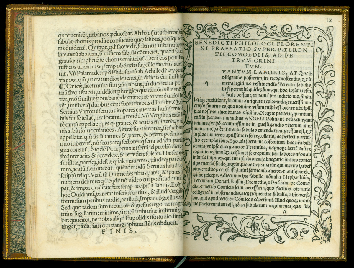
But then, as soon as the text of Terence began, the pretty borders and ornamental typography resumed. It was unusual at the period to segregate apparatus from school text with so sharp a design change. We cannot know for certain what Soardi had in mind, but the strategy had to be deliberate.
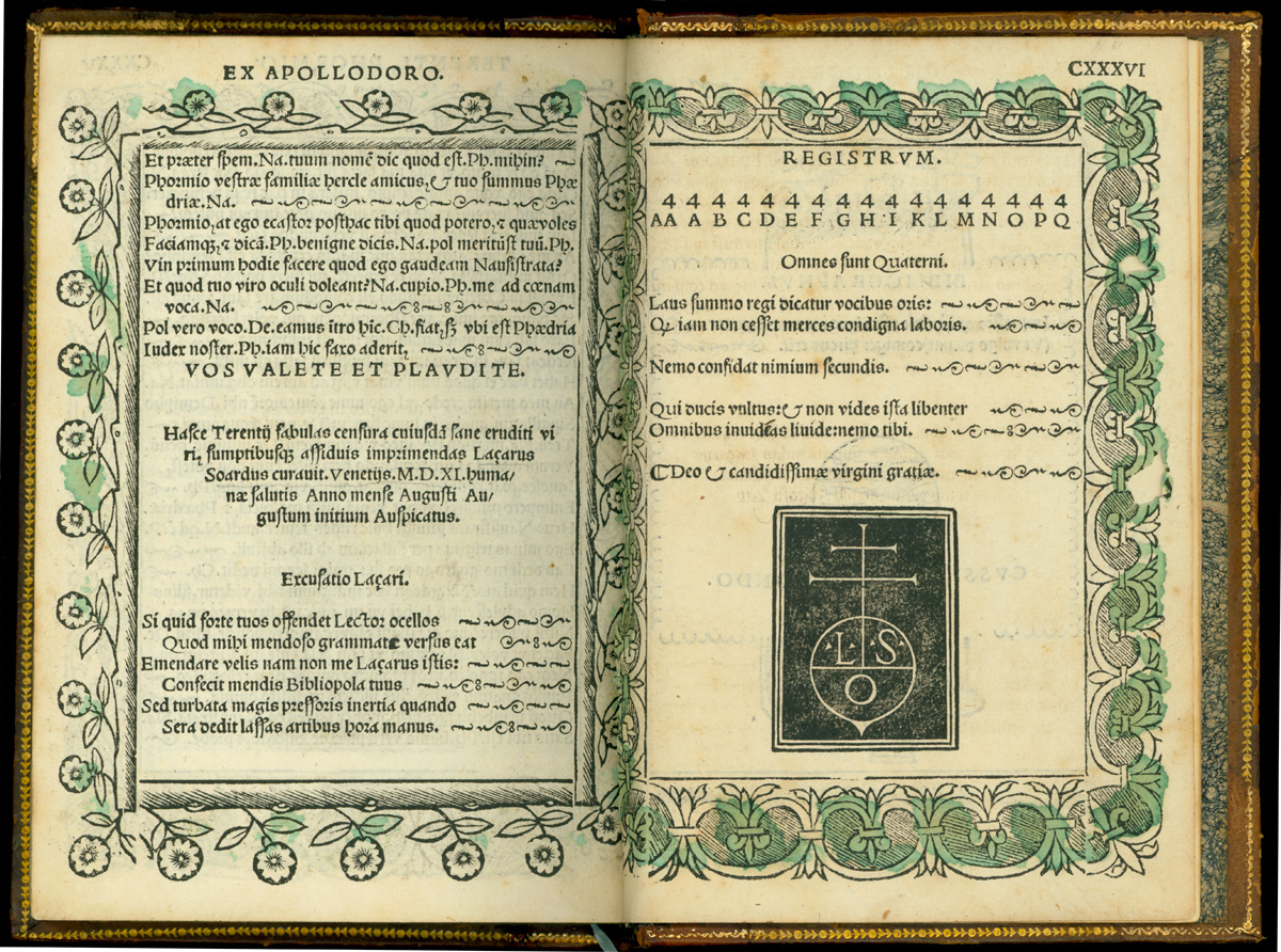
The last three pages of Soardi's octavo Terence contained the usual publication information but were also filled out with short prayers, proverbs, and poor verses about the processes of printing and book selling. These added materials could as well apply to other texts than Terence and some bits in fact appeared on other books from Soardi's press. They confirm our sense that this little Terence, for all its claims to textual originality, was offered for a student market. The colophon said the book was edited by "a certain learned man" (apparently the front matter sufficed to name him) and carefully printed by Lazzaro Soardi in August of 1511. This was followed by an "Apology of Lazzaro" (Excusatio Lazari) in which he said the reader should freely correct any errors that he finds. These six lines of verse conveniently contained a misprint that resulted in an error of noun-adjective agreement; it was corrected by hand in some copies. (59)
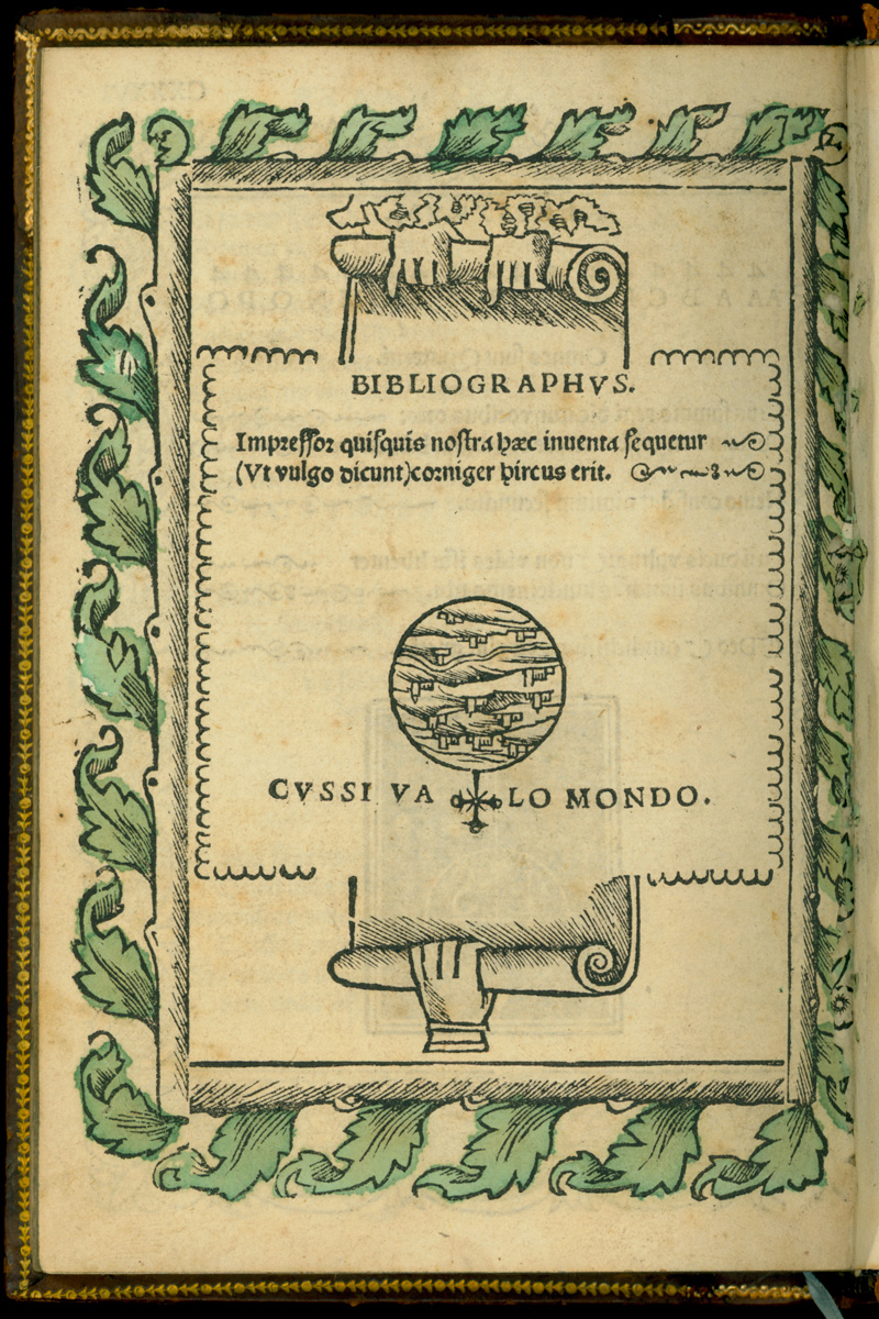
An emblem on the last page displayed the world turned upside down and an imprecation against anyone who would copy the work of Soardi -- "may he be a horned he-goat" (i.e. a cuckold).
NOTES Open Bibliography (330 KB pdf) (57) The same preface occurs in Giunta editions of 1509 and 1513. Godman 1998, 208 points out that Riccardini's claim is false; he did not in fact avail himself fully of Poliziano's textual work. (58) Terence 1511. (59) E.g. that at the Newberry Library, Chicago.