1.15 Design in Decline
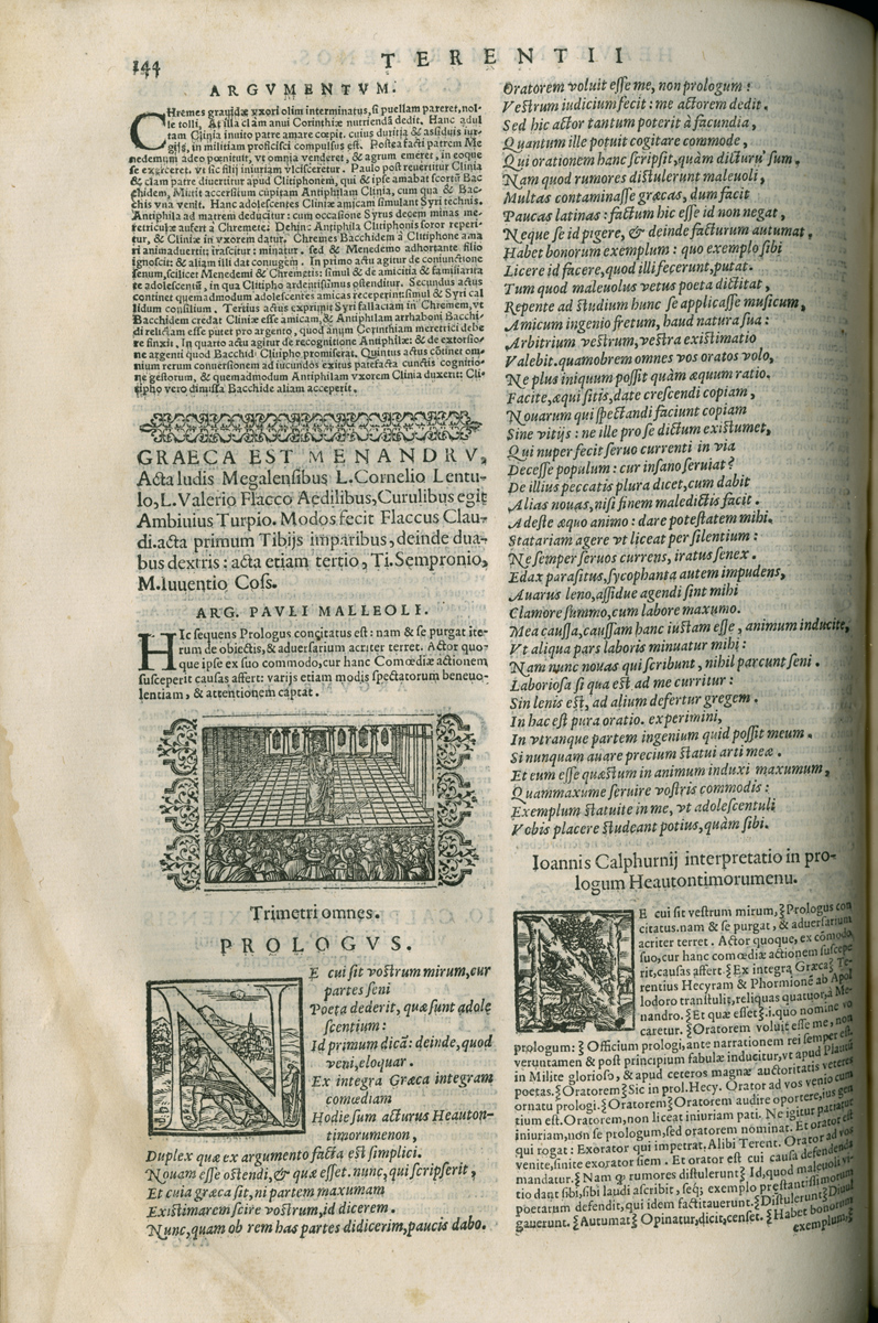
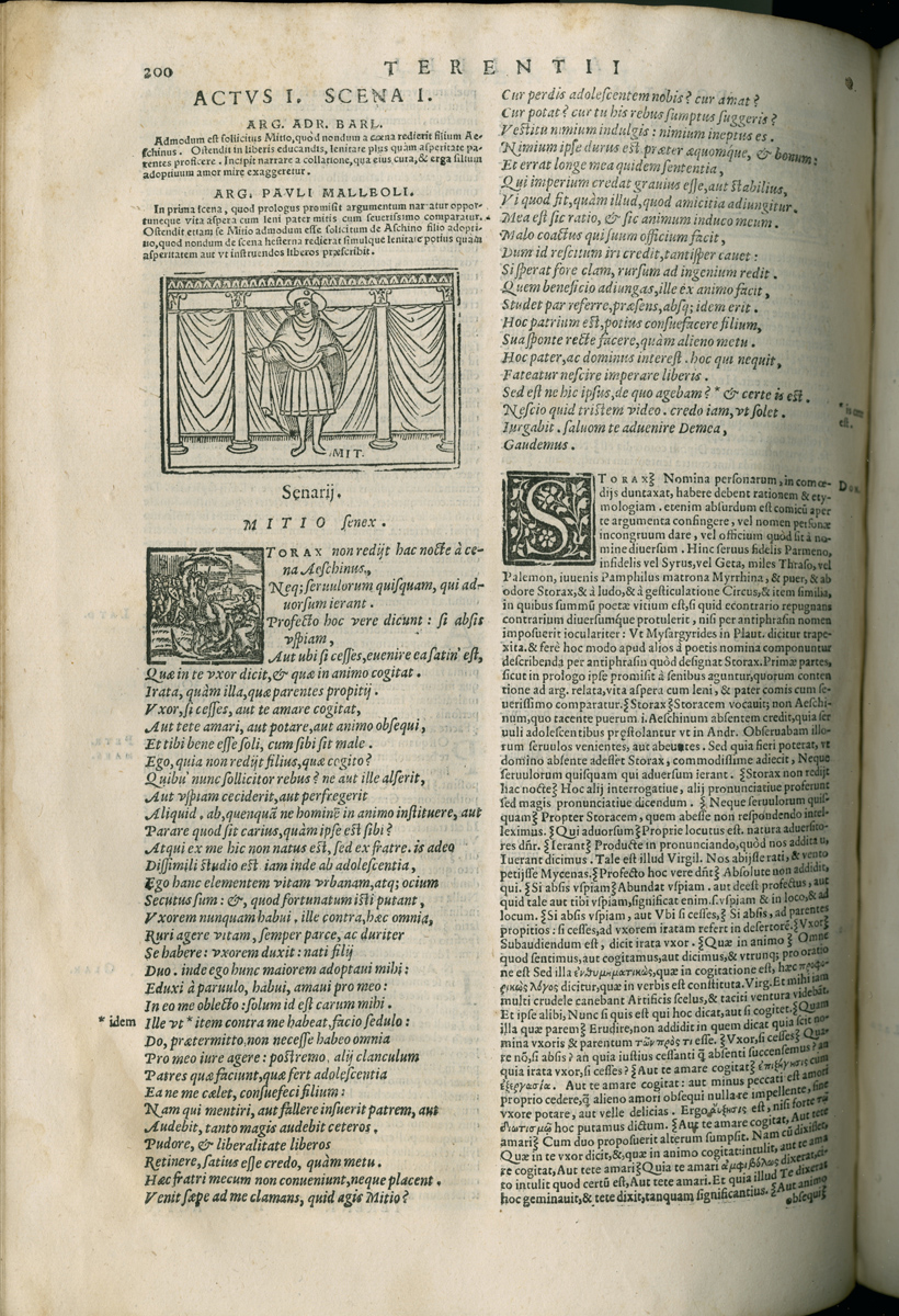
Inside folio Terences, the base text and commentaries varied far less than the front matter. Girolamo Scoto again set the standard in his 1545 edition. He provided three summaries for the action of each scene by three different humanist schoolmasters of note; the innovation was immediately copied by other publishers. Venturino Ruffinelli, who preferred his own layout and design (using comic-strip style illustrations), copied the 1545 text slavishly in 1546, but squeezed it into a page layout that had been designed for his 1539 edition of Gouveia's text. The basic layout problem in the case of Terence was that the text consists of short scenes with much back-and-forth badinage while the apparatus was typically very lengthy. As we have already noted, early printers of text with commentary had arranged the commentary for each scene in humanist-manuscript form all around the base text, creating a window or windows for the words of Terence. The resulting window-and-frame layouts are visually very lively, with each spread slightly different from the last, depending on the length of the commentary with respect to the text. (65) As the sixteenth century progressed, however, it became more usual to employ a simple two-column format that placed the base text of each scene first and the commentary afterwards, alternating but running continuously from column to column. The four columns on a spread owned variety and visual interest because the text of Terence was set in larger type and more generously leaded than the commentary, but the result was rarely as handsome as the older manuscript-style layouts. This two-column format took over because it was much easier to set, correct, revise, and reprint than a window-and-frame.

Similarly, fewer and fewer options were exercised in ornamenting and illustrating the folio text as the century wore on. Virtually the only ambitious editions from this point of view are the 1545 Scoto and the 1553 Cesano. These books preserve something of the grace of earlier folios, with both the repeated author portraits and the scene-by-scene illustrations that had characterized some folio editions in the fourteen nineties and early in the sixteenth century. Illustrations of individual scenes disappeared entirely after the 1555, perhaps because the enthusiasm for their rediscovery had waned, and again in recognition of the fact that they added little beyond their ornamental value. Once they had been reduced to comic-strip style, moreover, they could not claim any real utility, even if they once had it. Author portraits persisted a little longer, but slowly faded away too.

The single, nearly universal decorative element across the whole of the fifteenth and sixteenth century was the use of woodcut initials. To my knowledge, no new initial blocks were commissioned specifically for a Terence at any period. The initials were simply those a given printer had in stock or could borrow for the project at hand. The inevitable result was that schoolbooks tended to lag a few years behind the latest ornamental fashions. Iniziali parlanti ("speaking intitials" that included classical or biblical scenes) were fashionable in Venice from 1530 onward. They were duly employed for Terence, but their use in so workaday a text for school teachers was entirely pro forma. No scenes from the plays were ever incorporated into initials. (66) By the fifteen sixties the reused blocks typical in Venetian schoolbooks were so badly worn that their mythological stories can hardly be read. Terence would wait until the eighteenth century to merit truly pompous dress again.
NOTES Open Bibliography (330 KB pdf) (65) It could cause typesetting problems, as described by Petrella 2006, 168-171. (66) Nardelli 1991 treats this phenomenon but does not offer examples from editions of Terence. The several series she attributes to Giolitto, nos. 1-17 and 27-34, and to Valgrisi, nos. 28-34, appear in Terences from several publishers of the period. On the copying of such woodcut initials in metal, see Mosley 1994 and 1998.