7.14 Chubby Children and the Blessed Virgin
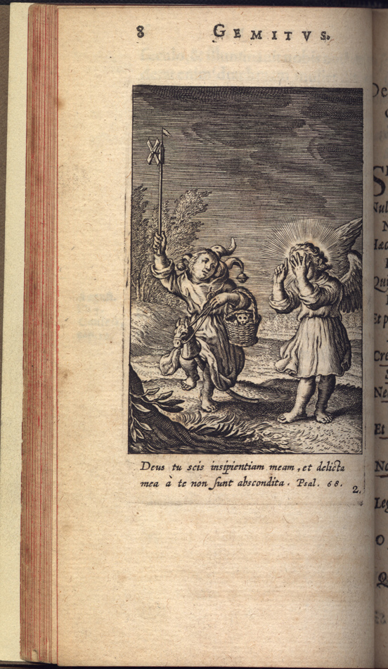
Part of Hugo's approach to younger students was his extensive use of adolescent guardian angels, and even more often child-angels, as protagonists in the images. These angels appeared alongside adults or children who represented the souls of the penitent. For example, Hugo and his engraver-collaborator Boëce van Bolswert (ca. 1580-1633) illustrated the Psalm-verse "Lord thou knowest my foolishness" with a cherubic guardian angel who covers his eyes rather than behold the antics of a fool. (53) The fool is depicted in more adult form than the angel, but they are about the same height, so their ages remain ambiguous. More important to understanding the dynamic of the child-angel is the fact that the angel is not mentioned in the motto or the poem and really plays no functional role in the theme of this emblem. The cherub here merely stands in for the reader as viewer of the emblematic action. In some cases both the guardian angel and the soul are children. (54)

Interestingly, the first edition of Hugo's Pia desideria published in Italy (Milan, 1634) took considerable freedom with these children and cherubs. Very occasionally, the childlike figures were preserved, as for example when both Dutch and Italian editions portrayed a childlike penitent before a bench at which a cherubic judge presides. (55) Sometimes the figures have merely aged a few years at Milan. The emblem for Job10,20, "Shall not the fewness of my days be ended shortly?" displayed a pair of very young children in 1624 and a pair of older ones in 1634. (56) More often however, the artist for the Milanese edition (probably Carlo Bianchi, fl. 1610-1635) made the protagonists over completely into adolescents or adults. The angel and the fool, for example, are both adults in the Milan version of Emblem I,5. In the very next emblem a child angel consoles a sick adult in 1624, but the angel in 1634 is clearly adolescent and not childlike. (57) Hermann Hugo and Boëce van Bolswaert apparently thought that introducing child actors and childlike observers was important to the thematic development of the book or to its potential audience. But Bianchi either did not understand this aim or had a different audience in mind. The 1634 Milan edition is dedicated to an aristocratic nun, so the publisher may have been thinking of convent readers rather than children. (58)
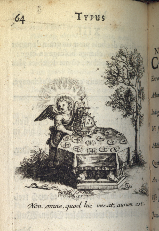
The Jesuits seem to have been particularly fond of chubby children. The Typus Mundi, published by the Antwerp Jesuit college in 1627 is full of them, often in improbable situations. There was little obvious reason to introduce a little angel into the scene of a table full of forged coins that illustrates the motto, "All that glitters is not gold" (Non omne, quod hic micat, aurum est).
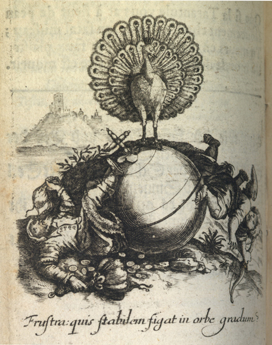
Nor did it add much to show both an adult bourgeois and a cupid falling from the spinning globe in an emblem that illustrates the instability of social standing. John Manning opines that "the use of children in emblem books was part of a palpable design on the reader, and it mattered little...whether this reader was an adult or a child. ...Calendar age ceased to matter under Christ's Gospel imperative to become as little children." (59)
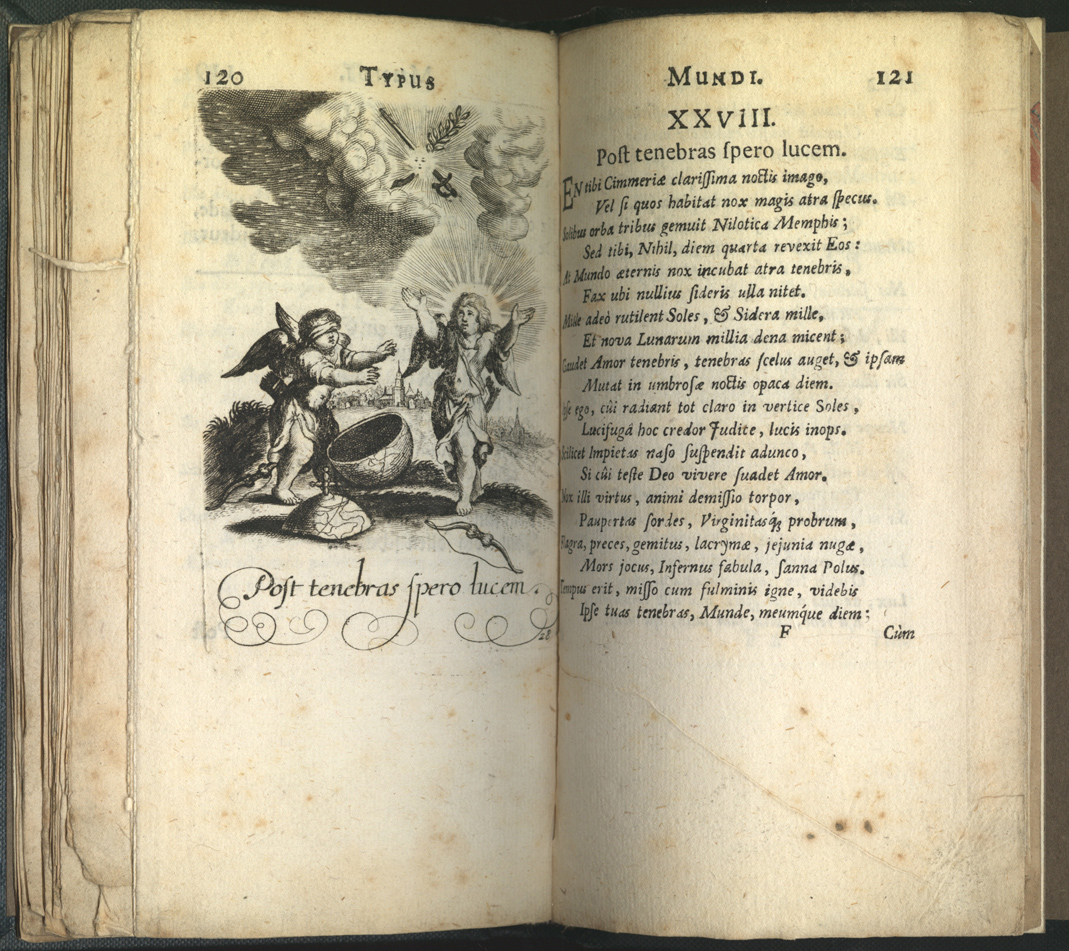
This evangelical theme was indeed widespread in emblem literature. But the Antwerp Jesuits had a further goal, I think, to include even their youngest charges into a community of learning where emblematic thinking became second nature. The artists and authors wanted children in the pictures specifically so readers would draw the conclusion that such morals were not for grownups only. Clearly, then, they had an audience in mind that included both real children and also older students who could still identify with children. (60)
Historians have tended to treat the so-called college emblem books in a separate category from other Jesuit emblems. These emblem collections were created and published by single Jesuit colleges. It is difficult to identify a specific audience for them, but they were not mere curiosities, since some titles ran to several editions. Books like these came out of the rhetoric curriculum. They offered completed exercises by advanced students (closely supervised by their instructors, of course). It is not clear that they were intended to be taken back into the classroom in a second moment.
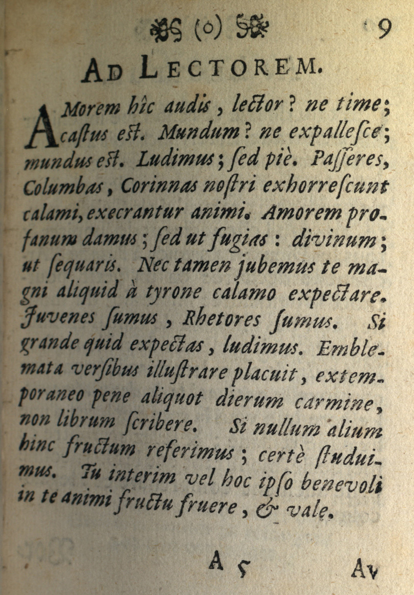
The students do seem to have bought into the notion of the emblem as an entertaining way of learning. Thus, the best known college book, the Typus Mundi, is exceedingly playful; the students made fun of themselves and even of their teachers. As their preface to the reader says, "œWe are youths, we are rhetoricians. Just when you expect a great deal of us, we play around." (61)
Inventing emblems was part of the rhetoric curriculum in Italy too, but few Jesuit colleges there produced emblems in print. The single, notable exception is the 1603 Imprese di Tre Academie Partenie, dedicated by its publisher Giovanni Battista Piccaglia to Cesare Speziano, reform-minded bishop of Cremona. This 106-page volume contains only three emblems, one for each of the Jesuit-sponsored Parthenic academies, supposedly extra-curricular confraternities of the Blessed Virgin restricted to small groups of noble students at the three largest Jesuit colleges in Rome, Naples, and Milan. Unlike Jesuit students from the Netherlands or France, these young noblemen did not offer true emblems. Instead, they followed the Italian fashion of inventing imprese, that is, truncated emblems with picture and motto but no explanatory poem. Instead, they provided lengthy prose explications attributed to the student presidents of each academy. It is clear that each academy's impresa was a group project of the advanced rhetoric students. They scoured ancient and medieval literature (and modern encyclopedic works) for learned quotations to embellish their understanding of the symbols chosen. The authors praised, among other things, cooperation among themselves both in spiritual life and in the pursuit of eloquence, chastity and devotion to the Blessed Virgin Mary, and real mastery of ancient literature. (62) They also made the point that the emblem of a student collective must be useful to all its members even those of only middling intelligence. (63) There is no doubt that the three emblem essays were separately composed, since the style and tone of each is distinct, but these are students who have learned their lessons well and have thoroughly internalized the Jesuit world view.
NOTES Open Bibliography (330 KB pdf) (53) Emblem I,5; Ps 68, 6: Deus tu scis insipientiam meam. (54) Manning 2002, 179 adduces "local visual convention" for these child figures and claims that Hugo could not have intended his complex baroque poetry for children. In fact the poems are no more complicated than any other classical or neo-classical poetry given to Latin schoolboys; and the images are simpler than most emblems. (55) Emblem I,10; Ps 142,2. (56) Emblem I,13: Numquid non paucitas dierum meorum finietur brevi? (57) Emblem I,6: Miserere me, domini, quoniam infirmus sum. (58) Hugo 1634 (CLEJ, no. J637) is dedicated to Lucrezia Maria Sfondrati, prioress of San Paolo Converso at Milan, on which see Baernstein 2002. Compare Hugo 1678 (CLEJ, no. J750), a second Italian edition, also dedicated to an abbess. (59) 2003, 165. (60) The inclusion of children was widely practiced in mannerist literature of all sorts; see for example, Gareffi 1981, 70-76. (61) Typus 1697, p. 9: Juvenes sumus, Rhetores sumus. Si grande quid expectas, ludimus. The words for studying and playing, of course, are the same in Latin; ludimus here means both "œwe study" and "œwe play." (62) Maggi 1998a, 123, 129-31; Maggi 1998b, 373-377; further on the Italian tradition of Marian emblems, Caldwell 2004, 259-273. (63) Imprese 1603, 33: ...dalle quali parole, e pitture traher potrà qualsivoglia mezzano ingegno nobilissimo sentimento.